Post Game Jam Review


So firstly, this entry was my introduction to itch.io, so I'll have to ask for some understanding that I may not be using this website to its utmost, or as intended, or as others do. As can be seen from the initial game jam entry for this project, aesthetics aren't exactly my strong suit!
Game Jam Review
With the 7 day window to create this game, here's a rough overview of how that time was utilitised;
- Idea Generation (2 hours)
- This essentially was all I did the first day. While this idea was actually the first thing I came up with, I tried to come up with ideas that were more obviously connected to the theme of the jam
- Art creation (5 hours)
- I spent ages trying to make the initial goblin sprite, and still wasn't all that happy with it. The other sprites received about 5 minutes each after that.
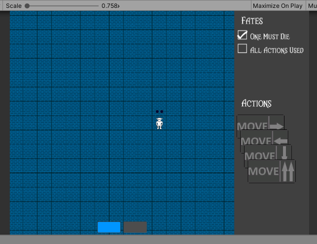
- I also had to redo the background/grid and action sprites, below shows the original attempt...

- Game Mechanics (4 days)
- Placing the actions on characters and advancing the turn timer was actually fairly straight-forward, outside of a few bugs.
- With about 2 days to go, I refactored a whole bunch of code to account for the "player choice" in the game (see below as to why), such as how to determine what outcome the player had achieved and design a system to generate the subsequent scene.
The unaccounted for days are actually because after a couple of days of working on the project I wasn't too happy with it, I'd managed to create the idea I'd had, but I didn't think it was actually much fun to play.
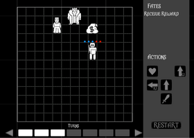
This is where I had the idea to make the scenes more open ended, while the player is obviously given a sword icon, I felt if they were given the choice on how to use it, it'd give them a reason to be invested in what they're doing, rather than just working out how to arrange the pieces to reach a predefined ending, kind of making it an interactive story.
Post Game Jam
Considering I was ready to can the project, it's interesting to me that I feel eager to refine it and make it into something more... Playable. One of the comments I've received is that the controls could do with some work, which I readily agree with, just something I became blind to while developing, since I guess I understood how everything worked. Definitely something to take away.
Immediate next steps are;
- Rewrite the actions system
- Rather than placing actions onto actors and moving them simultaneously with the turns meter, when an action is placed, it should have an immediate effect and increase the turn meter. That way if you want to undo an action, it's more obvious you just decrease the turn meter
- It'll also make actor interactions easier to account for, such as when a character should move right 3 spaces, but there's another character blocking their path
- Create more defined scenes
- The ones in the current build were ones I hastily threw together to try and meet the jam deadline, and don't really tell a coherent story.
- Add scene obstacles
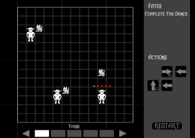
- Currently there's a fire in the goblin path, but it doesn't impact the player, in fact writing this... I haven't tried putting the "player" goblin in the path of one of the "dancing" goblins... Something to consider.
Why isn't art on the list? Because I'm awful at it... Something I'll tinker at along the way rather than getting bogged down with trying to set myself the goal of "improve UI".
Files
Fate Is Unwritten
Choose an outcome, contemplate how to achieve it.
| Status | Prototype |
| Author | kevshep |
| Genre | Puzzle, Adventure, Interactive Fiction |
| Tags | Meaningful Choices, Multiple Endings |
Leave a comment
Log in with itch.io to leave a comment.